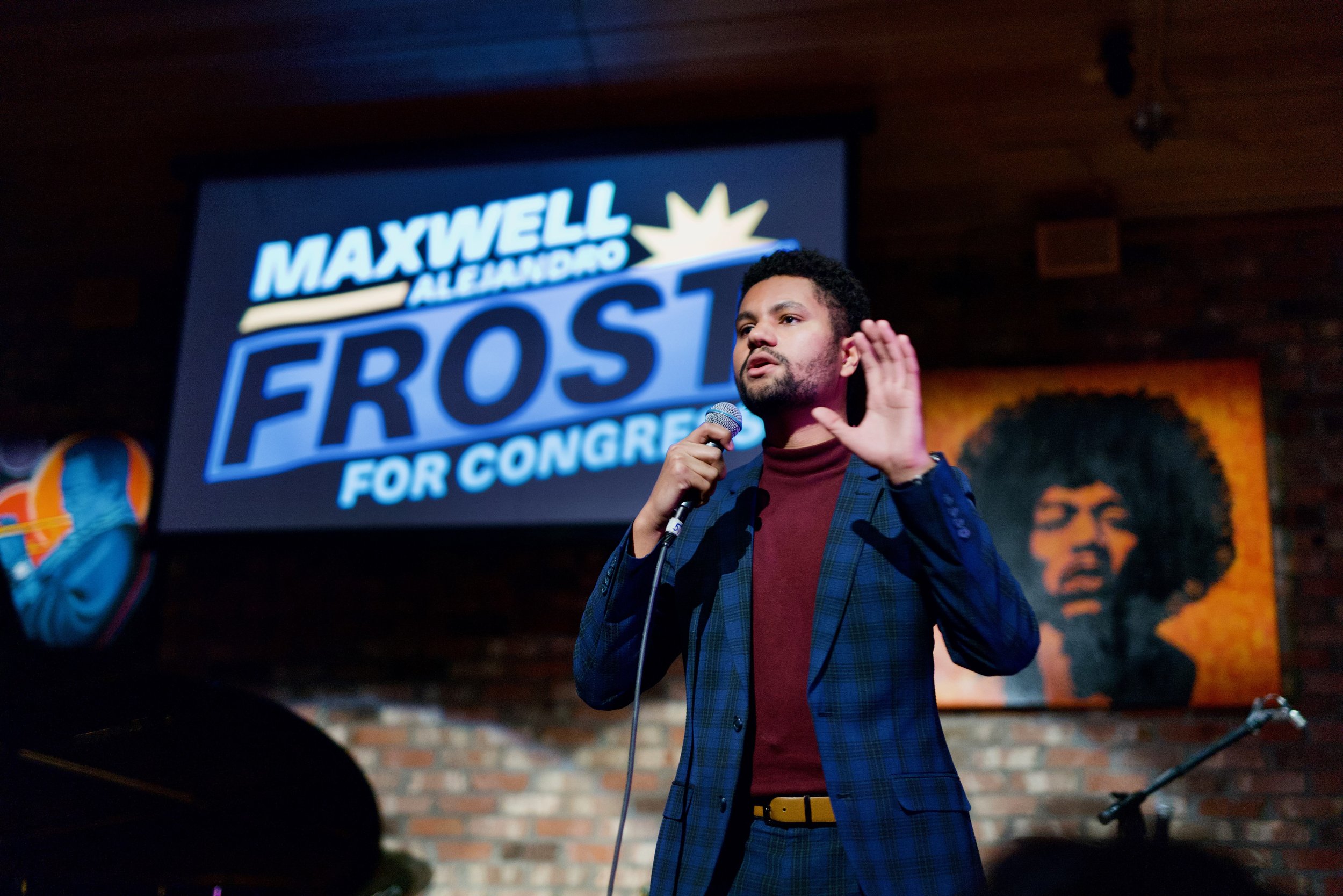
Maxwell Frost:
survivor, leader, and advocate.
Role: Creative Director
a campaign for the first gen-z member of congress.
The twenty-five-year-old Florida Democrat Maxwell Alejandro Frost was an activist before he was a politician. He did not run a campaign, he led a movement. His website and social ads had to be as bold, unexpected, and as inspiring as the candidate they represented.
I guided a team of designers in developing assets for his website and social ads, as well as handled the creation of the website through Squarespace so that campaign staffers could easily access it as needed. My team was responsible for seeing his website imagery and pages updated with the latest issues and media content. When it came to ads, we quickly created assets during the campaign. We developed a distinct, bold look and feel for Maxwell’s online presence.
A bold online personality.
For Maxwell’s website, our goals were to make his campaign memorable, his stance on issues clear, and above all else to reflect the bold approach he’d have to politics through his brand.
We capitalized on the Florida ocean blue and sunny oranges from his brand colors for a bright, clean web palette. We balanced this with the darker navy to add a more serious edge to the edge, and to allow for better legibility without eyestrain.
Photography choices always highlighted Maxwell’s ability to command a crowd and his fresh outlook with bolder fashion choices –– but still depicted him in a suit. We showed that Gen Z is ready to be taken seriously.
As site visitors explored, they were treated with subtle animations to pull them further down the page or invited to click a donate link.
Issues Navigation Icons
When navigating the campaign website, voters were treated to an Issues page uniquely Maxwell. My team created collage-like navigation icons to represent each of the topics addressed; clicking an icon would jump a site visitor down to that specific issue for fast navigation and less scrolling. The sun element found in all of them is a reference to the Florida sun in Maxwell’s logo.
Social Ads
For Maxwell’s own ads, we promoted a bold and confident image with typography to match it and simple messaging that highlighted how Maxwell Frost’s campaign was a movement rather than a straightforward campaign.
When it came to opposition ads, it was important to create designs that felt youthful and daring but did not directly look like Maxwell branding. We brought back the collage-like style for oppo ads and leaned into a 90s style treatment that was in vogue for Gen-Z in 2022.
Creative Considerations
Bold choices paid off for Maxwell Frost. It was important to toe the line between youthful and bold while still presenting him as a candidate to be taken seriously. AOC set the bar for proving that when it comes to campaigns and design, we don’t need to do things the same way. Maxwell proves we can always push further.


