BrandING & Website Launch
Creative Director and Designer
In 2023, Adam Hollier launched his bid for congress and reached out to my team to develop an impactful brand and launch website the represented his personality and goals for Michigan’s 13th District.
Brand Personality
Athletic and energetic branding to mirror Adam's personality and interests
Modern and unique approach that is specific to Adam, while still incorporating political design conventions
Elements inspired by Adam's military background
Streetwear-inspired design elements
Approach and Process
For all my political clients, I follow a few steps to get a deep understanding of their personality, campaign goals, and the area they are going to represent. Before any design work began, the following had to happen:
Conduct a client interview to give the client’s team an opportunity to go in-depth about Adam’s political journey, interests outside of politics, what he likes in design, and what is at the core of his campaign strategy.
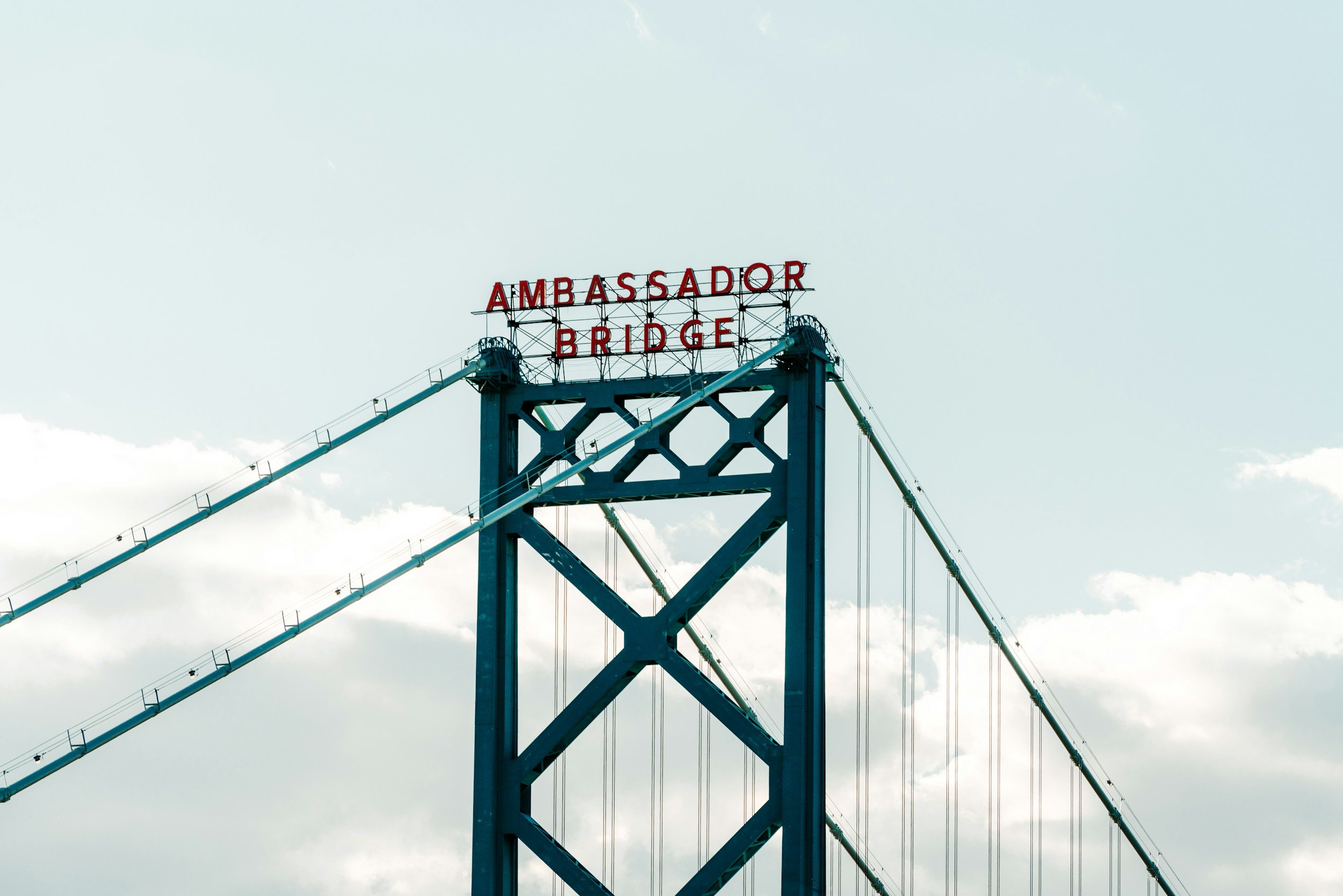
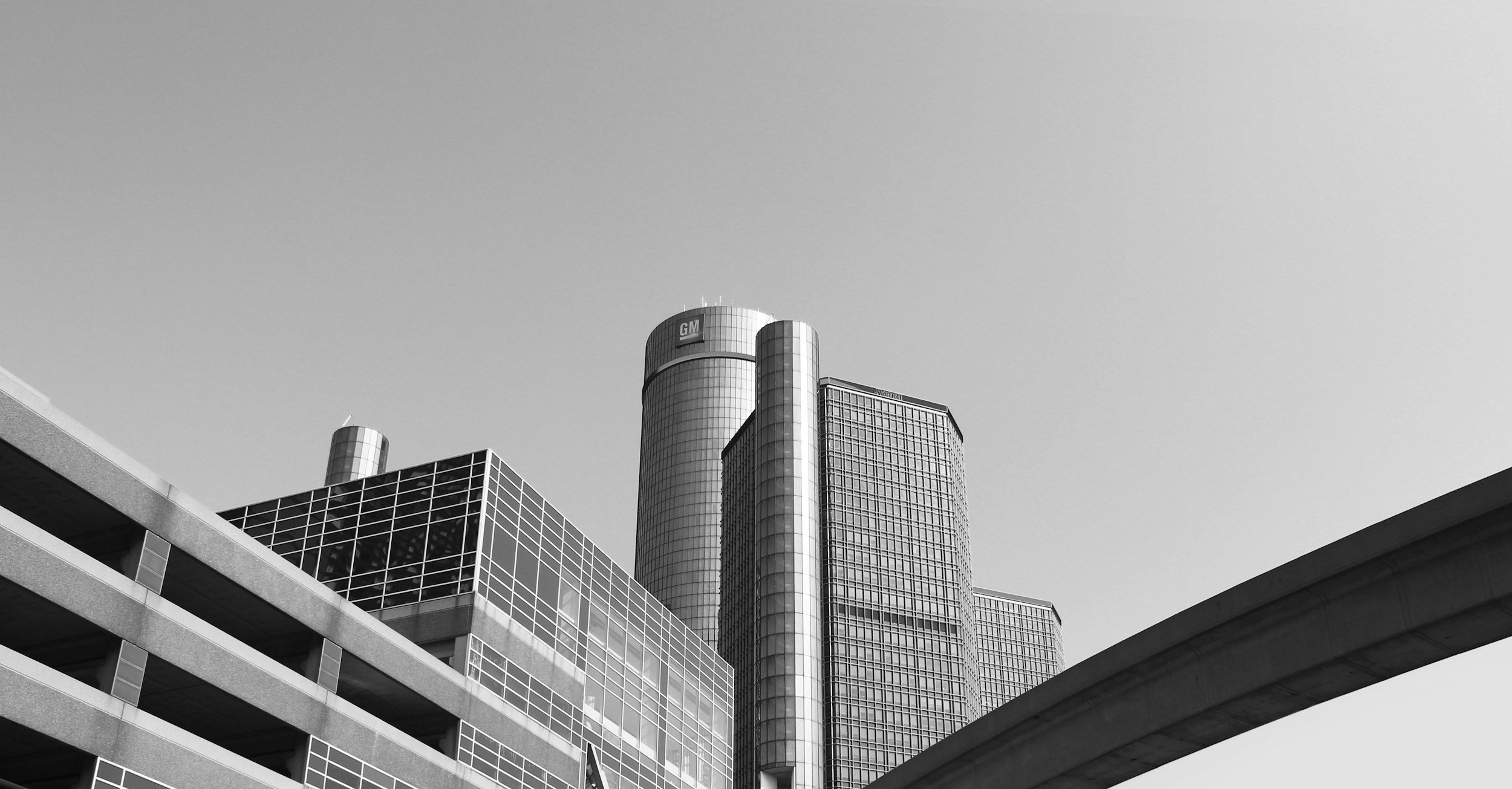
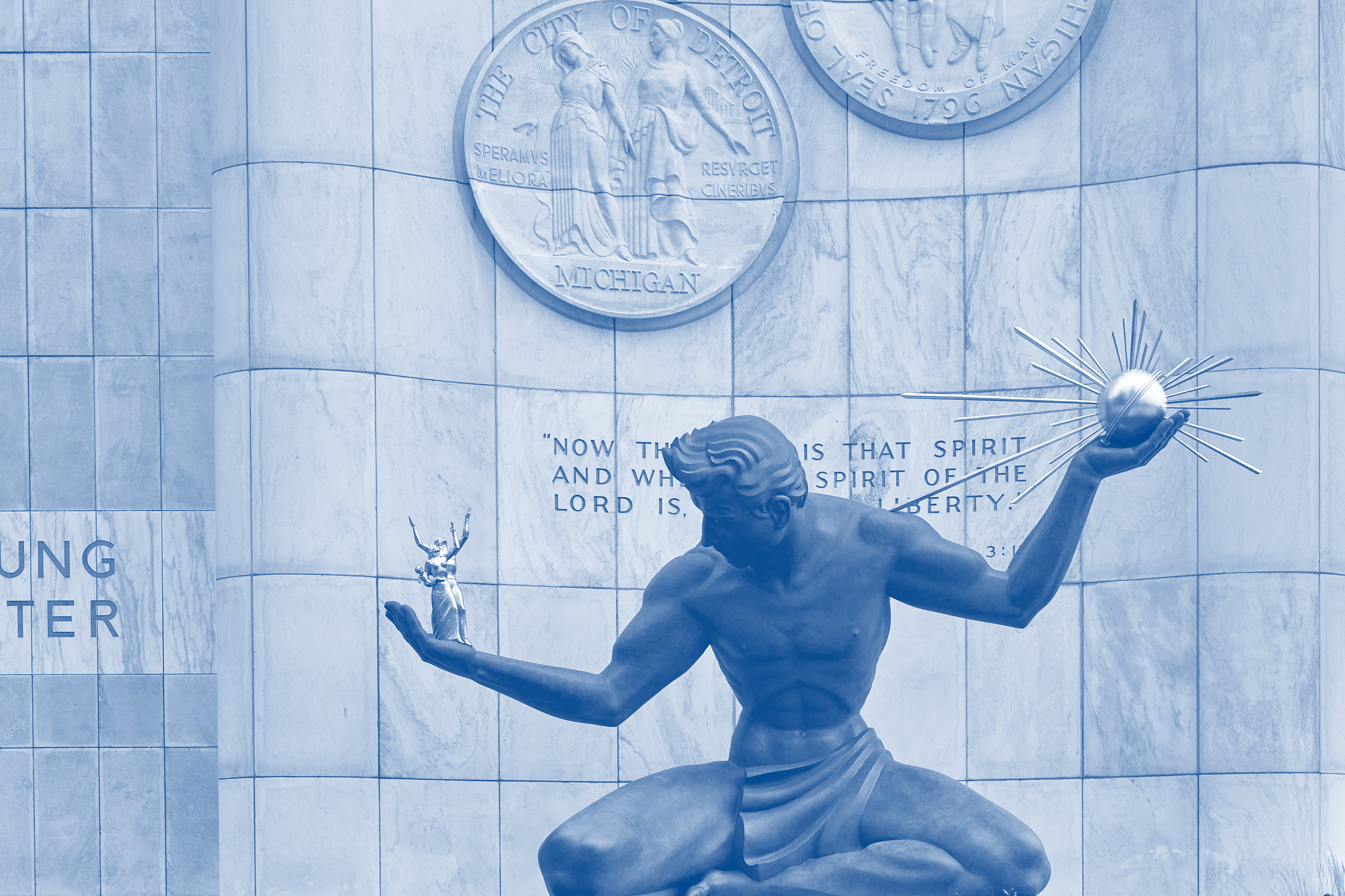
Independent research on other candidates he aspires to, his fellow running mates, and the area he represents. I pulled examples of interesting design solutions from the political space and collected imagery of the district.
Discussing existing brand elements and asking the client what they liked about their previous campaign’s logo and social elements, as well as what didn’t work and where they’d like to see change.
Creative Goals
Bold and distinct look:
Use of strong, contrasting colors that relate to Adam’s progressive goals
Solid, bold shapes to emulate strength and a steadfast personality
Adam should be represents as trustworthy:
Incorporate elements inspired by Adam's military background
Use imagery that highlight how he’s a dedicated father
Active, forward-thinking personality:
Use of dynamic, energetic design elements
Create a sense of movement and forward progress
moodboard
TYPEFACES
This palette features warm fall hues and soft, faded tones to evoke a rustic, vintage charm. This palette is inspired by the timeless comfort of the harvest season and homemade meals. I’ve included an even mix of different tones to give the brand flexibility while still maintaining ADA compliance.

The Palette
Adam's brand used Democrat blue and a military-inspired gold as the main colors, with red, white, a lighter blue, and parchment as supporting hues. We chose these colors to evoke a patriotic sentiment and give a nod to local sports teams. The supporting colors gave plenty of options for ADA compliance, while the key colors are ultra bright to add some energy to the brand.
TYPEFACES
The solidly built Shuttleblock logotype with its chamfered edges echoes the font style found in the U.S. Army logo and is a perfect homage to Adam’s military service. We paired it with the friendly, rounded Nunito Sans for body copy — it’s legible and softens the design a little. For headings, we used Merriweather to give a buttoned up but modern look to callout text.
Adam’s Logo Is inspired by forward movemenT.

Adam's brand draws inspiration from his athletic pursuits and reflect his energetic and driven approach to leadership. It incorporates elements of Detroit's dynamic, angled architecture and military-inspired details. The logo embodies his commitment to advancing key initiatives with vigor and determination.


The Website
Like his logo, Adam’s website need to feel vibrant and bold. We broke down his home page into colorful blocks for easier navigation and to better highlight the main goals of the site: list growth, donations, and a showcase on Adam’s story. Layering images and cutting them into dynamic shapes that echo his logo helped add energy to the design.
Final Notes
Adam launched with a bold and bright brand center around the idea of forward progress. This web and branding project helped to frame Adam’s goals for Michigan’s future with an optimistic and confident design approach.


